
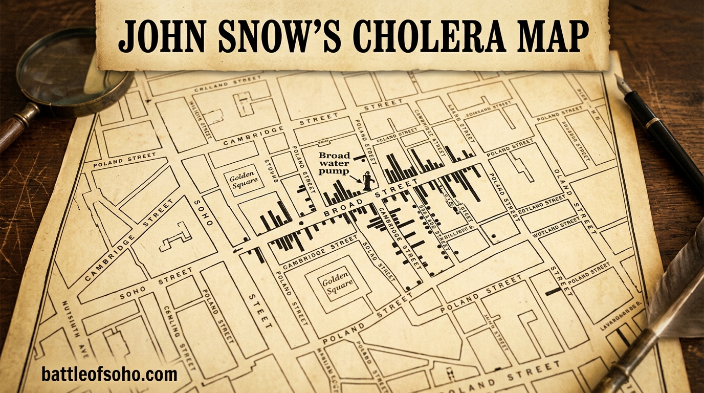
In the late summer of 1854, a deadly cholera outbreak swept through London’s Soho district, killing more than 600 people in a single neighborhood within ten days. Dr. John Snow, a local physician who had spent years arguing that cholera was waterborne, walked the streets of Soho recording every death on a hand-drawn map. The result was the famous cholera map Soho remembers to this day, a dot map showing cholera deaths clustered around a single water source: the Broad Street pump. This map did not just solve a local health crisis. It founded the science of epidemiology, proved that contaminated water (not bad air) spread cholera, and changed how cities around the world approach public health forever.
What makes the cholera map of 1854 so remarkable is the story behind it. Snow went door to door in a panicked neighborhood, knocking on doors and asking families who had died and where they had drawn their water. He marked each death as a black bar on a street map, and the visual pattern that emerged was unmistakable. Deaths radiated outward from one pump like rings in water. In an era when most doctors believed disease traveled through foul-smelling air (the miasma theory), Snow’s map offered something radical: visual, geographic proof that a single contaminated water pump was the source of the outbreak.
The story of the cholera map Soho made famous is not just about a map. It is about a doctor who trusted data over accepted wisdom, a neighborhood that faced annihilation, and a moment that reshaped medicine. It involves a forgotten collaborator named Henry Whitehead, a brewery whose workers mysteriously survived, a workhouse surrounded by death but largely untouched, and a pump handle that was removed in an act that became legendary, even if the reality is more complicated than the myth.
In this article, we walk through the full story of the 1854 Soho cholera outbreak and the map that made Soho a landmark in medical history. We cover what the map showed, how John Snow built it, why the Broad Street pump was the culprit, and what happened when the handle was removed. We also separate fact from popular myth, explore the role of Reverend Henry Whitehead, and provide a guide for visiting the site in modern Soho today.
Table of Contents
The Cholera Map Soho Will Never Forget: What Happened in 1854
The 1854 Soho cholera outbreak was one of the deadliest localized disease events in Victorian London’s history. Over the course of about ten days, from late August to early September 1854, cholera killed an estimated 616 people in the Golden Square area of Soho. That figure comes from John Snow’s own meticulous records, compiled in his 1855 report “On the Mode of Communication of Cholera.” The speed and ferocity of the outbreak were staggering. On the worst night, September 1, 1854, more than 140 people died in a single 24-hour period.
Soho in the 1850s was a densely populated, impoverished neighborhood. Streets were narrow, housing was overcrowded, and sanitation infrastructure was virtually nonexistent. Human waste collected in cesspools beneath houses, and contaminated water leaked into wells that served entire blocks. The Broad Street pump, located at the intersection of Broad Street (now Broadwick Street) and Cambridge Street (now Lexington Street), was a popular public water source. Residents walked there daily to fill buckets for drinking, cooking, and washing.
Cholera itself was a terrifying disease. Caused by the bacterium Vibrio cholerae, it produces severe diarrhea and dehydration that can kill a healthy adult within hours. In 1854, no one knew what caused cholera. There was no germ theory as we understand it today. The dominant belief was the miasma theory, which held that diseases spread through “bad air” produced by decaying organic matter, sewage, and industrial fumes. Soho, with its smells and poverty, seemed like exactly the kind of place where miasma would thrive.
This is the setting in which John Snow’s cholera map was born. The map was not drawn during the panic of the outbreak itself but compiled afterward as evidence in Snow’s published investigation. However, the data collection that fed the map happened in real time, as Snow walked the streets during the deadliest days of the crisis. The map became the visual centerpiece of his argument that cholera was a waterborne disease, and it remains one of the most famous examples of data visualization in history.
John Snow: The Doctor Who Became the Father of Epidemiology
John Snow was born in York in 1813, the son of a laborer who worked in a coal yard. He apprenticed as a surgeon-apothecary in Newcastle at the age of 14, where he first encountered cholera during the 1831-1832 epidemic that swept through the mining town of Killingworth. That early experience with cholera shaped the rest of his medical career. Snow moved to London in 1836, passed his MRCS examination at the Royal College of Surgeons in 1838, and established a general practice in the Soho area.
Long before the 1854 outbreak, Snow had already begun questioning the miasma theory. In 1849, he published a pamphlet titled “On the Mode and Communication of Cholera,” in which he argued that cholera was transmitted through contaminated water, not through the air. The medical establishment largely ignored or dismissed his claims. Miasma theory was the consensus, supported by prominent figures like Sir William Farr, the registrar general responsible for mortality statistics. Snow’s waterborne theory lacked a clear mechanism because the germ theory of disease had not yet been established. No one had identified Vibrio cholerae or understood how microscopic pathogens could survive in water.
What set Snow apart was his combination of clinical skill and analytical thinking. He was not just a theorist sitting in a study. He was a practicing physician who lived in the neighborhood where the 1854 outbreak occurred, which gave him immediate access to the affected streets, families, and water sources. Snow was also a pioneer in another field entirely: anesthesia. He designed a custom inhaler for chloroform and became one of London’s most sought-after anesthetists. In 1853, he administered chloroform to Queen Victoria during the birth of Prince Leopold, helping to legitimize obstetric anesthesia. This dual expertise, in both anesthesia and epidemiology, made Snow a unique figure in Victorian medicine.
Snow’s background matters because it explains why he was prepared to investigate the 1854 outbreak differently from his colleagues. He had spent years gathering evidence for the waterborne theory. When cholera struck Soho in August 1854, he saw an opportunity to prove his hypothesis with hard data. The cholera map Soho would become famous for was the product of a doctor who had been building toward this moment for at least five years.
The Outbreak: How the 1854 Soho Cholera Crisis Unfolded
The 1854 Soho cholera outbreak began in the final days of August. The first cases appeared around August 28 or 29, 1854, in the streets surrounding Golden Square. Within 48 hours, the number of deaths began climbing at an alarming rate. By August 31, 56 people had died. By September 1, the death toll had surged past 100, with more than 140 deaths recorded on that single day alone. The neighborhood was in a state of absolute terror.
Families who could afford to leave fled Soho immediately. Those who stayed watched neighbors collapse within hours of showing symptoms. The symptoms of cholera were violent and rapid: profuse watery diarrhea, vomiting, muscle cramps, and a dramatic drop in blood pressure. Victims often died of dehydration and shock before anyone could summon help. Bodies accumulated in homes and on doorsteps. Undertakers could not keep up with the demand for coffins.
John Snow was living and practicing in Soho at the time. He was already familiar with the neighborhood’s water supply, its cesspools, and its general sanitary conditions. As the outbreak escalated, Snow began his investigation. He did not wait for official approval or institutional support. He simply went to work, walking the streets, talking to residents, and recording the address of every cholera death he could verify.
The outbreak peaked around September 1-2, 1854, and then began to decline. By September 7, the daily death count had dropped significantly, and by mid-September the outbreak was largely over. This timeline matters because of what happened on September 7. On that date, Snow presented his findings to the Board of Guardians of St. James’s Parish and convinced them to remove the handle from the Broad Street pump. The popular version of the story says that removing the handle stopped the outbreak. The reality, as we will explore, is more nuanced. But the fact remains that the 1854 outbreak killed hundreds of people in a tiny geographic area over roughly ten days, and the cholera map that documented those deaths became one of the most important documents in medical history.
How John Snow Mapped the Outbreak: A Door-to-Door Investigation
The cholera map Soho made famous was not created in a single sitting. It was the product of a painstaking door-to-door investigation that took place during and immediately after the outbreak. Snow’s approach was methodical and personal. He walked the streets of Soho, knocked on doors, and spoke directly with families, building managers, and local officials. His goal was to record the exact address and circumstances of every cholera death in the Golden Square area.
Here are the key steps Snow took to build his investigation:
Step 1: Snow obtained the official death registrations for the Golden Square area from the General Register Office, which recorded cholera mortality data by address. This gave him a list of every recorded cholera death and its location.
Step 2: He visited as many of the affected households as possible in person. At each address, he asked which water source the family used. In most cases, the answer was the Broad Street pump.
Step 3: He noted anomalies. Some people who died far from Broad Street had recently visited the neighborhood and drunk from the pump. Some people who lived near the pump had not used its water and had survived. These exceptions were as important to Snow’s argument as the main cluster.
Step 4: He worked with a local surveyor and the General Register Office to plot each death on a street map of the Soho area. Each death was represented by a black bar or line at the corresponding address. The resulting dot map showed a clear visual concentration of deaths around the Broad Street pump.
Step 5: He published the map and his findings in 1855 as part of his expanded second edition of “On the Mode of Communication of Cholera.” The map was engraved and printed, making it available to other physicians, government officials, and the public.
It is worth noting that the popular image of Snow hunched over a map during the outbreak, plotting deaths in real time as they occurred, is somewhat romanticized. The map itself was published months after the outbreak ended. What Snow did during the outbreak was collect the raw data, door by door, which later became the map. The distinction matters because it highlights that the real genius of Snow’s work was his field investigation methodology, not just the visual representation. The map was the compelling visual evidence, but the shoe-leather epidemiology, the walking and questioning, was what made the evidence possible.
The Broad Street Pump: Identifying the Source
The Broad Street pump was a public water pump located at the corner of Broad Street and Cambridge Street in the heart of Soho. In 1854, public pumps were a common source of drinking water in London neighborhoods that lacked piped water connections. The Broad Street pump was fed by a well that drew groundwater from beneath the neighborhood. That groundwater was dangerously close to a cesspool that had been contaminated by the diapers of a cholera-infected baby, a detail later uncovered by Reverend Henry Whitehead.
When Snow plotted cholera deaths on his map, the pattern was unmistakable. Deaths clustered densely around the Broad Street pump and thinned out as distance from the pump increased. The closer a household was to the pump, the more likely its residents were to have died. This radial pattern was exactly what you would expect if a single contaminated water source was responsible for the outbreak.
The anomalies were just as revealing as the main cluster. Two groups in the immediate vicinity of the pump had almost no cholera deaths, and Snow investigated both:
The brewery workers: The Lion Brewery on Broad Street employed about 70 workers, none of whom died in the outbreak. The brewery had its own well, so workers never drank from the Broad Street pump. They also drank beer during the workday instead of water. Snow noted this anomaly and used it as supporting evidence that the pump water was the source.
The workhouse: The St. James’s Workhouse, located just around the corner on Poland Street, housed over 500 people. Only five died of cholera during the outbreak. The workhouse had its own well on the premises, so residents rarely used the Broad Street pump. Again, the pattern held: those who did not drink from the Broad Street pump largely escaped the disease.
These two exceptions were powerful evidence. They ruled out the miasma theory, because if cholera were spread through bad air, the brewery and workhouse, which were physically closest to the most affected streets, would have suffered the highest death rates. Instead, they were largely spared, because they had alternative water sources. Snow’s map made this argument visually, in a way that tables and statistics could not.
The Pump Handle Moment: Did Removing It Actually Stop the Outbreak?
On September 7, 1854, John Snow attended a meeting of the Board of Guardians of St. James’s Parish. He presented his findings and argued that the Broad Street pump was the source of the outbreak. The Board agreed to remove the pump handle, which effectively prevented residents from drawing water from the contaminated well. This moment has become one of the most famous events in public health history, often presented as the decisive action that ended the outbreak.
The truth is more complicated, and worth getting right. By September 7, the outbreak was already in sharp decline. The daily death count had peaked around September 1-2 and had been falling steadily for several days before the pump handle was removed. Most historians and epidemiologists who have studied the event agree that the outbreak was likely already winding down on its own, possibly because so many residents had already fled the neighborhood or died. The contaminated water in the well may also have been flushed through by that point.
So did removing the pump handle matter? Yes, but not for the reason most people think. It probably did not single-handedly stop the 1854 outbreak, which was already fading. However, it prevented future outbreaks by permanently removing a contaminated water source from the neighborhood. It also served as a powerful symbolic act. The removal of the pump handle represented the first time a government body took public health action based on epidemiological evidence rather than on miasma theory or guesswork. It validated Snow’s method and his map as tools for guiding public health decisions.
Snow himself was modest about the pump handle’s role. In his 1855 report, he acknowledged that the outbreak had already declined before the handle was removed, but he noted that deaths continued to occur at a lower rate after the removal. He also pointed out that some of the later deaths involved people who had stored Broad Street pump water in containers before the handle was removed and continued drinking it afterward. The pump handle story is not false, but it is simplified. The real lesson is that Snow’s evidence-based approach to identifying and removing a disease source was what mattered, even if the specific timeline does not match the popular narrative.
Miasma Theory vs. Waterborne Theory: The Scientific Battle
To understand why the cholera map Soho made famous was so revolutionary, you have to understand the scientific context of the 1850s. The dominant theory of disease transmission was the miasma theory, which held that illnesses like cholera, typhoid, and plague were spread through polluted air. Miasma was thought to come from rotting organic matter, sewage, industrial waste, and the general filth of overcrowded cities. The theory had intuitive appeal. Cholera outbreaks were worst in smelly, dirty neighborhoods. Sewage smells preceded outbreaks. The connection between foul air and disease seemed obvious to most physicians and public officials.
The problem with miasma theory was that it could not explain the specific patterns Snow observed. If cholera were airborne, it should spread evenly through a neighborhood, affecting people regardless of their water source. It should be worse in poorly ventilated areas and better in airy ones. But the 1854 Soho outbreak followed water lines, not air patterns. People who shared the same air but different water sources had completely different outcomes. The brewery workers and the workhouse residents breathed the same air as their dying neighbors, but they survived because they did not drink from the Broad Street pump.
Snow’s waterborne theory proposed that cholera was transmitted through ingestion of contaminated water containing some unknown infectious agent. Snow did not know about bacteria. He imagined a microscopic “morbid poison” or “cholera poison” that multiplied in the digestive tract and was excreted in feces, which could then contaminate water supplies. This was remarkably close to the truth, though the actual causative organism, Vibrio cholerae, was not identified until 1883 by Robert Koch.
The key differences between the two theories come down to mechanism and evidence:
Miasma Theory: Disease spreads through contaminated air. Prevention requires improving ventilation and removing sources of foul odors. Favored by most of the medical establishment in 1854.
Snow’s Waterborne Theory: Disease spreads through contaminated water. Prevention requires cleaning and protecting water supplies. Favored by Snow and a small minority, supported by his map and his earlier water company study.
Snow’s map was not the first evidence he gathered for the waterborne theory. His grand experiment, as he called it, was actually the water company comparison study in South London, where he compared cholera death rates between neighborhoods served by two different water companies drawing from different parts of the Thames. That study provided the large-scale statistical evidence. The Broad Street pump map provided the vivid, localized, visual evidence. Together, they made a case that was impossible to ignore, though it took years for the medical establishment to fully accept it.
Henry Whitehead: The Vicar Who Helped Solve the Mystery
The story of the 1854 cholera map Soho made famous is often told as a one-man show. John Snow collects the data, draws the map, identifies the pump, and saves the neighborhood. But there was a second investigator whose contribution was essential: Reverend Henry Whitehead, the assistant curate of St. Luke’s Church in Soho. Whitehead knew the Broad Street neighborhood intimately because he had been visiting its residents, especially the sick and dying, throughout the outbreak.
Whitehead initially disagreed with Snow’s waterborne theory. As a man of faith embedded in the community, he knew the neighborhood well, and he could think of reasons the pump theory might not hold. He began his own independent investigation, going door to door to test Snow’s conclusions. Whitehead’s local knowledge turned out to be invaluable. He identified a specific case that became the key to understanding the outbreak’s origin: the infant daughter of Thomas and Sarah Lewis at 40 Broad Street.
The baby had developed cholera symptoms around August 28 or 29, 1854, just before the outbreak began. Her dirty diapers were washed and the wastewater was disposed of in a cesspool at the front of the house. That cesspool was located just three feet from the Broad Street pump well. Snow and Whitehead later examined the cesspool and found that its brick lining was crumbling, allowing liquid waste to seep directly into the pump’s water supply. This was the contamination event that triggered the outbreak.
Whitehead’s discovery of the index case (the first case in the outbreak) was critical evidence that Snow’s map alone could not provide. The map showed where people died, but it could not show how the pump water became contaminated in the first place. Whitehead provided that missing piece, and in doing so, he became convinced that Snow was right. The two men’s collaboration, the physician with his data and the vicar with his community connections, represents one of the earliest examples of what we now call community-based participatory epidemiology. Most popular accounts of the cholera map leave Whitehead out entirely, which is a disservice to the historical record.
The Water Companies Investigation: Statistical Proof
While the Broad Street pump map is the most famous piece of John Snow’s evidence, it was not his most statistically powerful argument. That distinction belongs to his grand experiment, a massive study comparing cholera death rates in neighborhoods served by two different water companies in South London. This study provided the large-scale numerical evidence that supported his waterborne theory, and it is worth understanding alongside the Soho map.
In the early 1850s, two water companies served South London: the Southwark and Vauxhall Water Company, and the Lambeth Water Company. Both drew their water from the Thames, but they drew from different sections. Southwark and Vauxhall drew from a section of the Thames heavily polluted with London sewage. Lambeth, after relocating its intake upstream in 1852, drew from a cleaner section of the river above the tidal reach.
Snow recognized that this created a natural experiment. In many South London neighborhoods, the pipes of both companies ran side by side down the same streets. Customers did not always know which company supplied their water. The two groups lived in the same streets, breathed the same air, and had similar living conditions. The only meaningful difference was their water supply. If cholera were waterborne, neighborhoods served by Southwark and Vauxhall should have much higher death rates than those served by Lambeth.
The results were dramatic. Snow’s data showed that households served by Southwark and Vauxhall had a cholera death rate of approximately 315 deaths per 10,000 households. Households served by Lambeth had a death rate of approximately 37 deaths per 10,000 households. The difference was overwhelming and consistent across multiple districts. People drinking polluted Thames water were dying at nearly ten times the rate of people drinking cleaner water from upstream.
This study was the strongest epidemiological evidence Snow produced, and it predated the Broad Street outbreak by a year. But the South London study was statistical and abstract, presented in tables and numbers that were easy for opponents to argue with. The Broad Street map, by contrast, was visual and visceral. You could look at it and immediately see the pattern. Together, the two investigations, the large-scale water company study and the localized pump map, made a comprehensive case that cholera was waterborne. Neither piece of evidence alone was as convincing as the two combined.
Myth vs. Reality: What the Cholera Map Actually Proved
The cholera map Soho made famous has accumulated layers of myth over the decades. Popular accounts often oversimplify or exaggerate what Snow accomplished. Here are some of the most common misconceptions, and what actually happened:
Myth 1: The map alone proved cholera was waterborne. Reality: The map was powerful visual evidence, but Snow’s larger argument relied on multiple data sources, including the South London water company study, his door-to-door interviews, and his earlier 1849 pamphlet. The map was the most memorable piece, but it was not the whole proof.
Myth 2: Removing the pump handle stopped the outbreak. Reality: The outbreak was already in decline when the handle was removed on September 7. The removal likely prevented future cases and was symbolically important, but it probably did not end the 1854 outbreak on its own.
Myth 3: Snow proved germ theory. Reality: Snow did not identify Vibrio cholerae or prove that microscopic organisms cause disease. He disproved the miasma theory for cholera transmission and provided strong evidence for waterborne transmission. Robert Koch’s identification of the cholera bacterium in 1883 provided the microbiological proof.
Myth 4: The medical establishment immediately accepted Snow’s findings. Reality: Snow’s waterborne theory was largely rejected or ignored during his lifetime. Many physicians continued to believe in miasma theory well into the 1860s. Snow died in 1858, six years before William Farr, his former opponent, finally published data supporting the waterborne theory. Full acceptance came gradually over decades.
Understanding these distinctions does not diminish Snow’s achievement. If anything, it makes his work more impressive. He built his case with limited tools, against a hostile consensus, using nothing but careful observation and rigorous data collection. The myths are tidy. The reality is messier and more human, and ultimately more inspiring.
Visiting Soho Today: The Broad Street Pump Site and Modern Landmarks
One of the questions that comes up most often in forums and discussion groups about the cholera map is whether you can still visit the Broad Street pump. The short answer is yes, though the site has changed significantly since 1854. Broad Street was renamed Broadwick Street in the 1930s, and the original pump no longer exists. However, the neighborhood retains enough of its historic footprint that you can walk the same streets Snow walked and stand at the exact spot where the pump once stood.
Here is a guide to the key locations for anyone interested in visiting the site of the 1854 cholera map Soho story:
The Broad Street Pump Memorial: A modern replica of the pump, installed in 2018-2019, stands on Broadwick Street near the junction with Lexington Street (formerly Cambridge Street). The original pump location is marked by a pink granite curbstone and a plaque. This is the spot where Snow’s investigation centered, and where the famous pump handle was removed.
The John Snow Pub: Located at 39 Broadwick Street, this pub is named after Dr. Snow and serves as the unofficial headquarters for cholera map enthusiasts. The pub features a plaque commemorating Snow and displays information about the 1854 outbreak. The John Snow Society, which maintains Snow’s academic legacy, holds an annual meeting here.
Golden Square: The small park at the center of the 1854 outbreak area still exists. It was once the heart of the most affected neighborhood and is a quiet green space surrounded by modern offices and restaurants. Walking from Golden Square to the pump site takes about two minutes.
The site of 40 Broad Street: The house where the Lewis baby, the index case identified by Whitehead, lived and died is no longer standing. The approximate location is on what is now Broadwick Street, near the pub. A historical marker in the area provides context.
The former Lion Brewery site: The brewery whose workers escaped the outbreak was located on the site now occupied by the Soho campus. The building was demolished in the late 19th century, but the street layout retains traces of the original neighborhood.
For visitors interested in a walking tour, the entire cholera map area can be covered in about 30 minutes on foot. The neighborhood today is a busy commercial district of restaurants, shops, and offices, a far cry from the overcrowded, foul-smelling slum of 1854. But the street grid, the pump location, and the story embedded in the paving stones make it one of the most significant medical history sites in the world.
Legacy: How One Map Founded Modern Epidemiology
The cholera map Soho made famous did more than solve a single outbreak. It established a template for disease investigation that is still used today. Snow’s approach, collecting data on individual cases, plotting them geographically, identifying patterns, and testing hypotheses against the evidence, is the foundational method of modern epidemiology. Every outbreak investigation conducted by the CDC, the WHO, and public health agencies worldwide traces its methodological ancestry back to John Snow’s 1854 investigation.
The map also pioneered the field of data visualization. Snow’s dot map, showing individual deaths as marks clustered around a point source, was one of the earliest examples of using geographic data visualization to reveal a causal pattern. Today, this kind of mapping is standard practice in fields ranging from public health to urban planning to environmental science. Geographic Information Systems (GIS), now a multi-billion-dollar industry, owe a direct debt to Snow’s cartographic innovation. Modern tools like contact tracing apps, real-time outbreak dashboards, and spatial epidemiology software all build on the principle Snow demonstrated: that mapping disease cases geographically can reveal the source and mechanism of transmission.
The broader impact of Snow’s work on public health infrastructure was enormous. The cholera map contributed to a growing movement for sanitation reform in Victorian London, which culminated in the construction of London’s modern sewer system by Joseph Bazalgette in the 1860s. That sewer system, built in response to decades of cholera outbreaks and the infamous Great Stink of 1858, transformed London’s water supply and eliminated cholera as a major threat in the city. The principles Snow established, that clean water prevents disease and that data can guide public health policy, became the foundation of municipal water treatment, chlorination standards, and the global effort to provide safe drinking water that continues to this day.
In popular culture, Snow’s cholera map reached a new audience through Steven Johnson’s 2006 bestselling book “The Ghost Map,” which dramatized the 1854 outbreak for a mainstream readership. The book cemented the cholera map’s status as one of the great stories of science and helped introduce a new generation to the origins of epidemiology. The story has been taught in medical schools, public health programs, geography courses, and data science bootcamps, a rare example of a single historical event that spans so many disciplines.
What is John Snow’s cholera map?
John Snow’s cholera map is a dot map created in 1854 showing the geographic distribution of cholera deaths in London’s Soho district. Each death was marked as a black bar on a street map, revealing a dense cluster around the Broad Street water pump. The map provided visual evidence that cholera was transmitted through contaminated water, not through bad air as the miasma theory held.
What caused the cholera outbreak in Soho in 1854?
The 1854 Soho cholera outbreak was caused by contaminated water from the Broad Street pump. A baby at 40 Broad Street contracted cholera in late August 1854, and her infected diaper wash water seeped into the pump’s well through a crumbling cesspool. Residents who drank from the pump ingested the cholera bacterium Vibrio cholerae, leading to over 600 deaths in about ten days.
What did John Snow practically do to understand the cause of cholera in Soho?
John Snow conducted a door-to-door investigation during the outbreak. He obtained official death registrations by address, visited affected households to ask which water source they used, noted exceptions like the brewery and workhouse, and plotted every cholera death on a street map of Soho. This field investigation produced the data for his famous dot map, which showed deaths clustering around the Broad Street pump.
What was John Snow’s conclusion that contaminated water was associated with cholera based on?
Snow’s conclusion was based on two major lines of evidence: the Broad Street pump investigation, which showed cholera deaths clustering around a single water source, and the South London water company study, which showed that households served by a company drawing polluted Thames water had nearly ten times the cholera death rate of those served by a company drawing cleaner upstream water. Together, these provided geographic and statistical proof that cholera was waterborne.
Did removing the Broad Street pump handle actually stop the outbreak?
The outbreak was already in decline by the time the pump handle was removed on September 7, 1854. The daily death count had peaked around September 1-2 and was falling steadily. Most historians agree that removing the handle probably did not single-handedly end the outbreak, but it removed a contaminated water source and prevented future cases. It also marked the first time a government took public health action based on epidemiological evidence.
Who was Henry Whitehead and what was his role in the cholera investigation?
Henry Whitehead was the assistant curate of St. Luke’s Church in Soho who knew the Broad Street neighborhood intimately. He initially doubted Snow’s waterborne theory and conducted his own door-to-door investigation. During that work, he identified the index case: a baby at 40 Broad Street whose diaper wash water had contaminated the pump well. This discovery provided the critical missing evidence and convinced Whitehead that Snow was correct.
Can you still visit the Broad Street pump site in Soho today?
Yes. The original pump no longer exists, but a replica was installed in 2018-2019 on Broadwick Street (formerly Broad Street) near the junction with Lexington Street. The John Snow Pub at 39 Broadwick Street serves as a memorial, and the John Snow Society holds an annual event there. The entire cholera map area can be walked in about 30 minutes.
Conclusion: Why the Cholera Map Soho Made Famous Still Matters
The cholera map Soho made famous in 1854 is more than a historical curiosity. It is the moment when data visualization met public health and changed the world. John Snow walked the streets of a dying neighborhood, recorded every death, and produced a map that proved contaminated water was killing his neighbors. That map, combined with his larger water company study and the community knowledge of Henry Whitehead, overturned centuries of medical belief and laid the foundation for modern epidemiology.
The story of the cholera map also carries lessons that feel urgent in 2026. Disease outbreaks still happen. Contaminated water still kills millions worldwide. The tools have changed, from hand-drawn maps to satellite surveillance and genome sequencing, but the principle is the same. Follow the data, question the consensus, and let evidence guide action. That is what John Snow did in Soho in 1854, and it is why his cholera map remains one of the most important documents in the history of medicine.
If you want to explore further, Steven Johnson’s “The Ghost Map” is the most accessible popular account of the story. For a more academic treatment, the PMC article on Snow and the Broad Street Pump provides detailed statistical analysis. And if you find yourself in London, take 30 minutes to walk Broadwick Street, stand at the pump memorial, and visit the John Snow Pub. The neighborhood has changed beyond recognition, but the ground beneath your feet is where modern public health was born.